Categories
DH Pedagogy Tools UVA Collaboration

If You Want to Master Something, Teach it: Digital Humanities and the “Aha!” Moment

[Enjoy this guest post by Nora Benedict, a PhD student in the Department of Spanish, Italian, & Portuguese at the University of Virginia. She came to give a workshop through a Mellon-funded collaboration with the Scholars’ Lab at UVA. Her post is cross-listed on the Scholars’ Lab blog.]

I was recently invited to give a guest lecture in Caleb Dance’s Classics Course (“Blasts from the Classical Past: In Consideration of the Ancient Canon”) at Washington and Lee University as part of their Mellon Foundation Grant for Digital Humanities, which provides support for research, workshops, guest lectures, and the general development of Digital Humanities initiatives. As a contemporary Latin American scholar, who works on Jorge Luis Borges and publishing history, I was, at first, quite daunted by the task of teaching about classical canons and antiquity. Lucky for me (and the students), I was asked to work through possible avenues of investigation for their final project, “Book Biographies,” that required students to add their own text to the class’s “canon” and justify their selection with quantitative and visual data. More specifically, Caleb asked me to present students with a series of approaches for the project, including any necessary platforms and databases, and also touch on some potential problems that might arise in the process.

Before diving into a discussion of the digital tools for the day, I wanted to pause and parse out what exactly a “bibliographical biography” might be. Or rather, what students understood as “bibliographical” or a “bibliography” more generally. The entire class immediately defined the term to mean a list of works cited and used for research (i.e. enumerative bibliography). I then added to their definition by introducing the concepts of descriptive, analytical, and textual bibliography. We spent the most time walking through descriptive bibliography, or the physical descriptive of books as objects, because I felt that an understanding of this branch of bibliography would best serve students in thinking about the physical data necessary for their projects.

I devoted the remainder of the class to presenting students with two avenues of investigation for their digital humanities projects. For fear of selecting a classical work that another student might have already chosen for his/her own project, I used Jorge Luis Borges’s Ficciones (1944) as my example text to add to their class “canon.”
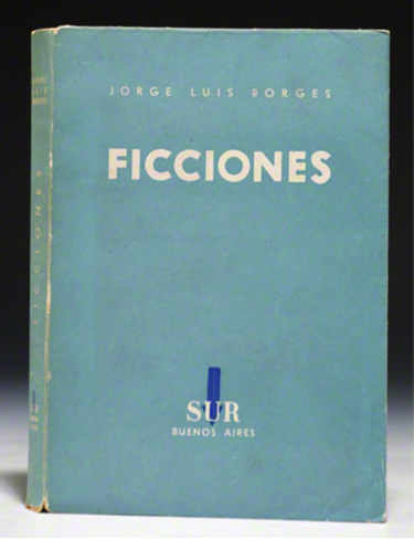
First, drawing on my own current digital project, I introduced students to different modes of visualizing data with digital tools. For starters, I asked students what types of questions they might ask their chosen books to gather the necessary data to populate a map or visualizing tool. Together, we formed a list that included the work’s printing history, cost, copies produced, places of publication, languages of publication, and circulation, which would all help students to answer the central question of why their book should be added to the class’s “canon.” Moreover, I continually emphasized the need to accumulate as much physical data as possible about their work, and keep this information in an easily readable format (such as an excel spreadsheet).

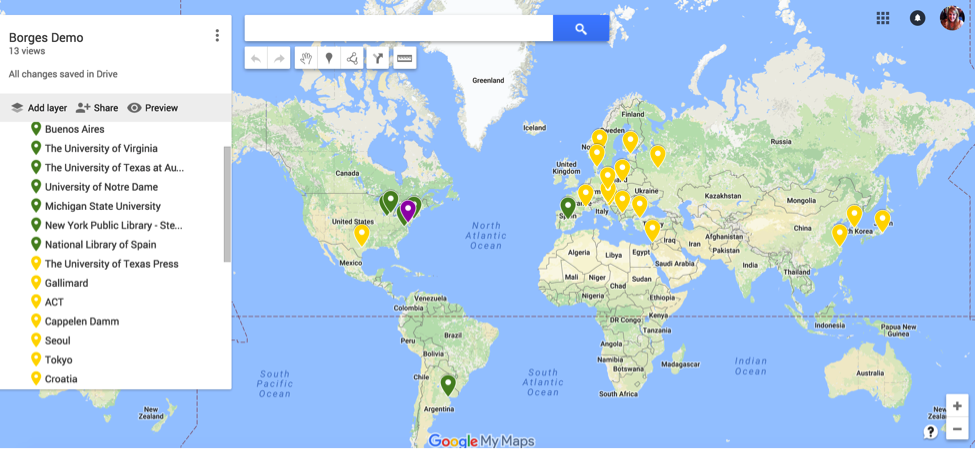
Next, I showed them a demo project I created with an annotated Google map, which plotted the locations of archival materials, such as manuscripts and correspondence, in green and translations of Ficciones in different languages in yellow. As a class, we added new plot points to track the circulation of Ficciones in libraries in the United States with data we quickly acquired from WorldCat in purple:
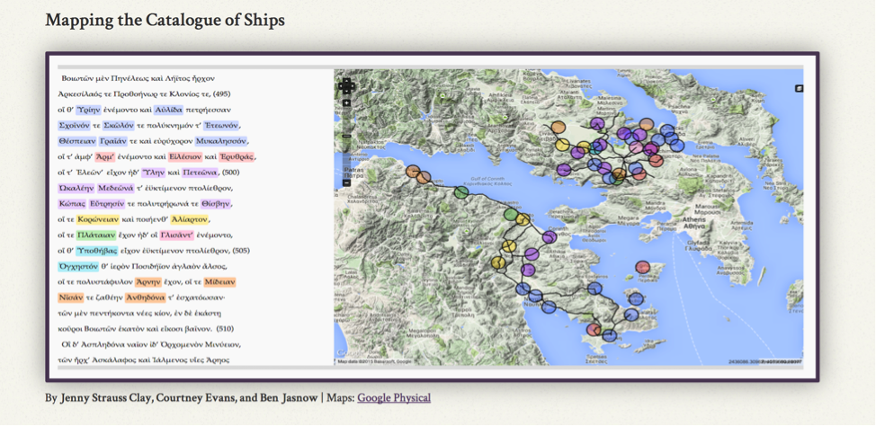
After we mapped out several locations and entered detailed metadata for each point, I wanted to show students several examples of more advanced data visualization projects. My hope was that as these students explored and experimented with their first digital humanities projects, they would be inspired to work with more complex platforms and programs for future projects. Given my own training in the UVA Scholars’ Lab, their unique program Neatline was the most logical place to turn. In particular, I walked the students through a demo of the project, “Mapping the Catalogue of Ships,” which relies on data gathered from the second book of the Iliad to map the physical route discussed based on the locations named, which seemed most appropriate for a Classics course:
While platforms and programs for data visualization allowed the students to see the immediate impact of their selected text in terms of its production and circulation, I wanted to also push them to think about ways to represent the links, connections, and relations between certain authors and works across time and space. For starters, I asked students to think about how many works have been written about their selected texts (in terms of literary references, allusions, critical studies, or even parodies). I then showed them DBPEDIA, which extracts data and datasets from Wikipedia pages for further analysis. Looking to the page dedicated to Jorge Luis Borges, I scrolled to the section of writers that are influenced by him:
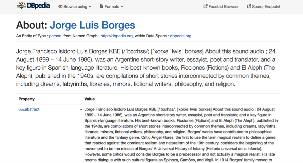
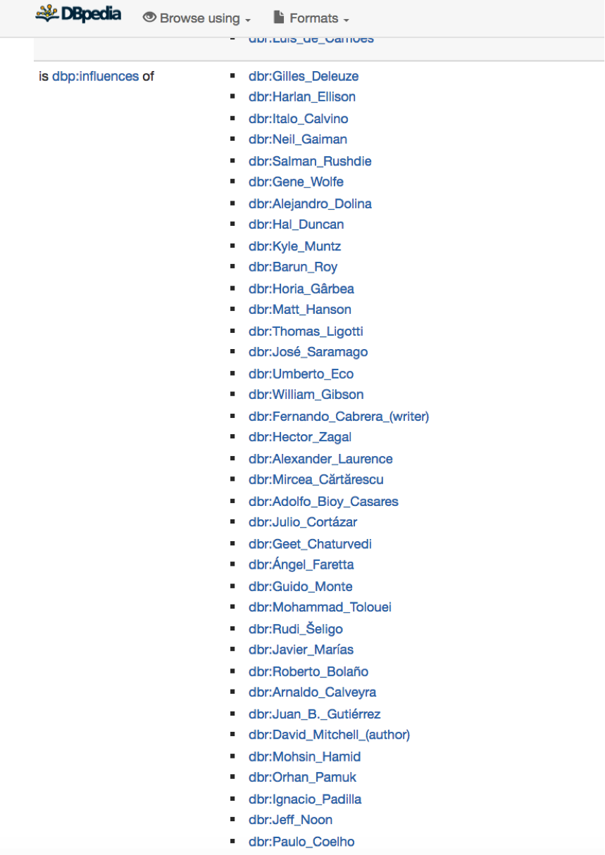
Thinking about the various names on this list, and the potential writers that might populate the lists for their own selected writers, allowed students to see the possible outcomes of analyzing social networks of impact. I told students that this type of data was not limited to people and could be expanded to think about various historical, social, or even political movements.

After discussing several possible ways to gather data about the social networks related to their own texts, I showed the students a few examples of how their data might visually manifest itself, drawing on sample screenshots from Cytoscape, a platform which helps create complex network visualizations:
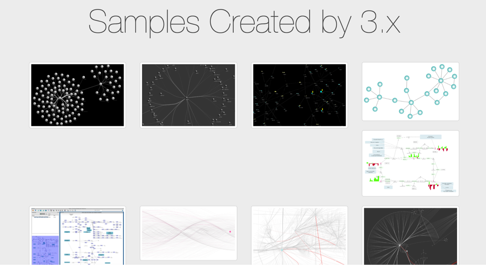
Walking through a few visual examples of network analysis with digital platforms got students really excited for their own projects and their potential outcomes. I then introduced students to Palladio, which is one specific tool engineered by Stanford Digital Humanities for their “Mapping the Republic of Letters” that they might consider using for their own projects. One of the most intriguing aspects of this tool is the ways in which you can manipulate your data. More specifically, as we saw with the sample dataset, you are able to visualize your information in the form of a map, a graph, a table, or through a photo gallery of the players involved:
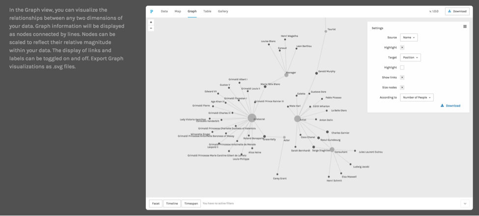
This variety in format was particularly promising for students that hoped to present their projects in diverse ways and draw on both visualization and social network tools.

Even though we experienced some connectivity issues due to a campus-wide network outage, students were able to see the benefits of using digital humanities approaches for their own projects while also getting a feel for a few of these tools with hands-on tutorials. Moreover, instead of panicking about sites and videos that wouldn’t load for the students, I stepped back and saw these connection problems as a teaching moment. In particular, I embraced the slow internet speeds as a catalyst for reflecting on minimal computing and questions of access in certain parts of the world, such as Latin America. In turn, I encouraged the students to think critically about their projected audiences and how they hoped to not only present their ideas digitally, but also how they hoped to preserve them and make them accessible to a wide range of people.

As a whole I am eternally grateful to Washington and Lee and Caleb Dance for this opportunity to share some of my favorite digital humanities tools, tips, and tricks with undergraduate students and introduce them to software and platforms that can make many of their imagined projects a reality. With each new tool we discussed, I was overjoyed to see students feverishly writing notes and having “Aha!” moments about their unique projects. Much of my DH fellowship year in the Scholars’ Lab has been about exploration and experimentation that tends to end in failure and a return to the drawing board, but, in the process, I’ve learned an incredible amount and had my own personal “Aha!” moments. Successfully being able to teach these students about data visualization and social network analysis was, quite possibly, the biggest “Aha!” moment of my DH fellowship thus far and a real turning point in my career as a digital humanities teacher-scholar.
Categories
Announcement DH Research Projects Tools

New Resource – Ripper Press Reports Dataset

[Crossposted on my personal blog.]

Update: since posting this, Laura McGrath reached out about finding an error in the CSV version of the data. The version linked to here should be cleaned up now. In addition, you will want to follow steps at the end of this post if using the CSV file in Excel. And thanks to Mackenzie Brooks for her advice on working with CSV files in Excel.

This semester I have been co-teaching a course on “Scandal, Crime, and Spectacle in the Nineteenth Century” with Professor Sarah Horowitz in the history department at W&L. We’ve been experimenting with ways to make the work we did for the course available for others beyond our students this term, which led to an open coursebook on text analysis that we used to teach some basic digital humanities methods.

I’m happy to make available today another resource that has grown out of the course. For their final projects, our students conducted analyses of a variety of historical materials. One of our student groups was particularly interested in Casebook: Jack the Ripper, a site that gathers transcriptions of primary and secondary materials related to the Whitechapel murders. The student group used just a few of the materials on the site for their analysis, but they only had the time to copy and paste a few things from the archive for use in Voyant. I found myself wishing that we could offer a version of the site’s materials better formatted for text analysis.

So we made one! With the permission of the editors at the Casebook, we have scraped and repackaged one portion of their site, the collection of press reports related to the murders, in a variety of forms for digital researchers. More details about the dataset are below, and we’ve drawn from the descriptive template for datasets used by Michigan State University while putting it together. Just write to us if you’re interested in using the dataset – we’ll be happy to give you access under the terms described below. And also feel free to get in touch if you have thoughts about how to make datasets like this more usable for this kind of work. We’re planning on using this dataset and others like it in future courses here at W&L, so stay tuned for more resources in the future.


Title

Jack the Ripper Press Reports Dataset

Download

he dataset can be downloaded here. Write walshb@wlu.edu if you have any problems accessing the dataset. This work falls under a cc by-nc license. Anyone can use this data under these terms, but they must acknowledge, both in name and through hyperlink, Casebook: Jack the Ripper as the original source of the data.

Description

This dataset features the full texts of 2677 newspaper articles between the years of 1844 and 1988 that reference the Whitechapel murders by Jack the Ripper. While the bulk of the texts are, in fact, contemporary to the murders, a handful of them skew closer to the present as press reports for contemporary crimes look back to the infamous case. The wide variety of sources available here gives a sense of how the coverage of the case differed by region, date, and publication.

Preferred Citation

Jack the Ripper Press Reports Dataset, Washington and Lee University Library.

Background

The Jack the Ripper Press Reports Dataset was scraped from Casebook: Jack the Ripper and republished with the permission of their editorial team in November 2016. The Washington and Lee University Digital Humanities group repackaged the reports here so that the collected dataset may be more easily used by interested researchers for text analysis.

Format

The same dataset exists here organized in three formats: two folders, ‘by_journal’ and ‘index’, and a CSV file.

  • by_journal: organizes all the press reports by journal title.
  • index: all files in a single folder.
  • casebook.csv: a CSV file containing all the texts and metadata.

Each folder has related but slightly different file naming conventions:

  • by_journal:
    • journal_title/YearMonthDayPublished.txt
    • eg. augusta_chronicle/18890731.txt
  • index:
    • journal_title_YearMonthDayPublished.txt
    • eg. augusta_chronicle_18890731.txt

The CSV file is organized according to the following column conventions:

  • id of text, full filename from within the index folder, journal title, publication date, text of article
  • eg. 1, index/august_chronicle_18890731.txt, augusta_chronicle, 1889-07-31, “lorem ipsum…”

Size

The zip file contains two smaller folders and a CSV file. Each of these contains the same dataset organized in slightly different ways.

  • by_journal – 24.9 MB
  • index of all articles- 24.8 MB
  • casebook.csv – 18.4 MB
  • Total: 68.1 MB uncompressed

Data Quality

The text quality here is high, as the Casebook contributors transcribed them by hand.

Acknowledgements

Data collected and prepared by Brandon Walsh. Original dataset scraped from Casebook: Jack the Ripper and republished with their permission.


If working with the CSV data in Excel, you have a few extra steps to import the data. Excel has character limits on cells and other configurations that will make things go sideways unless you take precautions. Here are the steps to import the CSV file:

  1. Open Excel.
  2. Make a blank spreadsheet.
  3. Go to the Data menu.
  4. Click “Get External Data”.
  5. Select “Import Text File”.
  6. Navigate to your CSV file and select it.
  7. Select “Delimited” and hit next.
  8. In the next section, uncheck “Tab” and check “Comma”, click next.
  9. In the next section, click on the fifth column (the column one to the right of the date column).
  10. At the top of the window, select “Text” as the column data format.
  11. It will take a little bit to process.
  12. Click ‘OK’ for any popups that come up.
  13. It will still take a bit to process.
  14. Your spreadsheet should now be populated with the Press Reports data.
Categories
Announcement DH Pedagogy Publication Tools

Introduction to Text Analysis: A Coursebook

[Crossposted on my personal blog.]

I am happy to share publicly the initial release of a project that I have been shopping around in various talks and presentations for a while now. This semester, I co-taught a course on “Scandal, Crime, and Spectacle in the 19th Century” with Professor Sarah Horowitz in the history department here at Washington and Lee University. The course counted as digital humanities credit for our students, who were given a quick and dirty introduction to text analysis over the course of the term. In preparing for the class, I knew that I wanted my teaching materials on text analysis to be publicly available for others to use and learn from. One option might be to blog aggressively during the semester, but I worried that I would let the project slide, particularly once teaching got underway. Early conversations with Professor Horowitz suggested, instead, that we take advantage of time that we both had over the summer and experiment. By assembling our lesson plans far in advance, we could collaboratively author them and share them in a format that would be legible for publication both to our students, colleagues, and a wider audience. I would learn from her, she from me, and the product would be a set of resources useful to others.

At a later date I will write more on the collaboration, particularly on how the co-writing process was a way for both of us to build our digital skill sets. For now, though, I want to share the results of our work – Introduction to Text Analysis: A Coursebook. The materials here served as the backbone to roughly a one-credit introduction in text analysis, but we aimed to make them as modular as possible so that they could be reworked into other contexts. By compartmentalizing text analysis concepts, tool discussions, and exercises that integrate both, we hopefully made it a little easier for an interested instructor to pull out pieces for their own needs. All our materials are on GitHub, so use them to your heart’s content. If you are a really ambitious instructor, you can take a look at our section on Adapting this Book for information on how to clone and spin up your own copy of the text materials. While the current platform complicates this process, as I’ll mention in a moment, I’m working to mitigate those issues. Most importantly to me, the book focuses on concepts and tools without actually introducing a programming language or (hopefully) getting too technical. While there were costs to these decisions, they were meant to make any part of the book accessible for complete newcomers, even if they haven’t read the preceding chapters. The book is really written with a student audience in mind, and we have the cute animal photos to prove it. Check out the Preface and Introduction to the book for more information about the thinking that went into it.

The work is, by necessity, schematic and incomplete. Rather than suggesting that this be the definitive book on the subject (how could anything ever be?), we want to suggest that we always benefit from iteration. More teaching materials always help. Any resource can be a good one – bad examples can be productive failures. So we encourage you to build upon these materials in your courses, workshops, or otherwise. We also welcome feedback on these resources. If you see something that you want to discuss, question, or contest, please drop us a line on our GitHub issues page. This work has already benefited from the kind feedback of others, either explicit or implicit, and we are happy to receive any suggestions that can improve the materials for others.

One last thing – this project was an experiment in open and collaborative publishing. In the process of writing the book, it became clear that the platform we used for producing it – GitBook – was becoming a problem. The platform was fantastic for spinning up a quick collaboration, and it really paid dividends in its ease of use for writers new to Markdown and version control. But the service is new and under heavy development. Ultimately, the code is out of our control, and I want something more stable and more fully in my hands for long-term sustainability. I am in the process of transferring the materials to a Jekyll installation that would run off GitHub pages. Rather than wait for this final, archive version of the site to be complete, it seemed better to release this current working version out into the world. I will update all the links here once I migrate things over. If the current hosting site is down, you can download a PDF copy of the most recent version of the book here.

Categories
DH Project Update Tools

Embedding COinS Metadata on a Page Using the Zotero API

[Cross-posted on my personal blog]

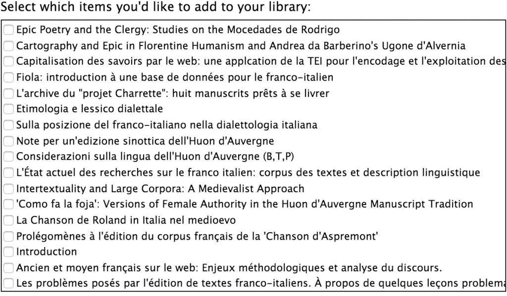
This year I am working with Mackenzie, Steve McCormick, and his students on the Huon d’Auvergne project, a digital edition of a Franco-Italian romance epic. Last term we finished TEI-encoding of two of the manuscripts and put them online, and there is still much left to do. Making the digital editions of each manuscript online is a valuable scholarly endeavor in its own right, but we’ve also been spending a lot of time considering other ways in which we can enrich this scholarly production using the digital environment.

All of which brings me to the bibliography for our site. At first, our bibliography page was just a transcription of a text file that Steve would send along with regular updates. This collection of materials is great to have in its own right, but a better solution would be to leverage the many digital humanities approaches to citation management to produce something a bit more dynamic.

Steve already had everything in a Zotero, so my first step was to integrate the site’s bibliography with the Zotero collection that Steve was using to populate the list. I found a python 2 library called zot_bib_web that could do all this quite nicely with a bit of modification. Now, by running the script from my computer, the site’s bibliography will automatically pull in an updated Zotero collection for the project. Not only is it now easier to update our site (no more copying and pasting from a word document), but now others can contribute new resources to the same bibliography on Zotero by requesting to join the group and uploading citations. The project’s bibliography can continue to grow beyond us, and we will capture these additions as well.

Mackenzie suggested that we take things a bit further by including COiNS metadata in the bibliography so that someone coming to our bibliography could export our information into the citation manager of their choosing. Zotero’s API can also do this, and I used a piece of the pyzotero Python library to do so. The first step was to add this piece to the zot_bib_web code:

zot = zotero.Zotero(library_id, library_type, api_key)
coins = zot.collection_items(collection_id, content='coins')
coin_strings = [str(coin) for coin in coins]
for coin in coin_strings:

fullhtml += coin

Now, before the program outputs html for the bibliography, it goes out to the Zotero API and gets COinS metadata for all the citations, converts them into a format that will work for the embedding, and then attaches each returned span to the HTML for the bibliography.

Now that I had the data that I needed, I wanted to make it work a bit more cleanly in our workflow. Initially, the program returned each bibliographic entry in its own page and meant for the whole bibliography to also be a stand-alone page on the website. I got rid of all that and, instead, wanted to embed them within the website as I already had it. I have the python program exporting the bibliography and COinS data into a small HTML file that I then attach to a <div id="includedContent"> inserted in the bibliography page. I use some jQuery to do so:

<script type="text/javascript">

$(function(){
$("#includedContent").load("/zotero-bib.html");
});
</script>

Instead of distributing content across several different pages, I mark a placeholder area on the main site where all the bibliographic data and metadata will be dumped. All of the relevant data gets saved in a file ‘zot-bib.html’ that gets automatically included inside the shell of the bibliography.html page. From there, I just modified the style so that it would fit into the aesthetic of the site.

Now anyone going to our bibliography page with a Zotero extension will see this in the right of the address bar:

Screen Shot 2016-02-08 at 1.07.04 PM

Clicking on the folder icon will bring up the Zotero interface for downloading any of the items in our collection.

Screen Shot 2016-02-08 at 1.13.09 PM

And to update this information we only need to run a single python script from the terminal to re-generate everything.

The code is not live on the Huon site just yet, but you can download and manipulate these pieces from an example file I uploaded to the Huon GitHub repository. You’ll probably want to start by installing zot_bib_web first to familiarize yourself with the configuration, and you’ll have a few settings to update before it will work for you: the library id, library type, api key, and collection ID will all need to be updated for your particular case, and the jQuery excerpt above will need to point to wherever you output the bibliography file.

These steps have strengthened the way in which we handle bibliographic metadata so that it can be more useful for everyone, and we were really only able to do it because of the many great open source libraries that allow others to build on them. It’s a great thing – not having to reinvent the wheel.

Categories
Pedagogy Tools

TimelineJS & the British Reformations

Students in a British history course recently completed an extensive timeline of the British Reformations in context. Professor Michelle Brock structured the project as an assignment that amounted to 15% of the course grade. The timeline also serves as a resource for students writing their final essays for the course. This approach to DH emphasizes that digital projects are not simply end products but also can inform written works.

Screenshot of British Reformations in Context timeline

TimelineJS was chosen by Brock as the appropriate tool for this project due to its visual capabilities. Prior to the beginning of the term, Brock consulted with the DHAT to plan how to instruct students on using this tool to contextualize the British Reformations. An essential feature was the tag functionality of TimelineJS to indicate whether an event occured in the English Reformation, Scottish Reformation, or the Continental European Reformation. Brock describes the goal of the assignment:

“The goal of this three-tiered timeline is to give student a visual overview of the trajectory of the European, English, and Scottish Reformations, and a more tangible representation of the relationship between the three. This should also provide a deeper understanding of the English and Scottish Reformations in their European contexts, as well as an illustration of their respective local and national dimensions. Students will then use this timeline to help write their final essay.”

Students worked in three groups of four to populate the spreadsheet that powers the timeline. Students were responsible for identifying and entering key events, documents, and people for their respective Reformation (a period spanning between 1450 – 1650). Each entry had to include a brief descriptive paragraph (80 – 120 words) explaining the significance of the topic. Students were encouraged to include images where appropriate. And, if applicable, students could include links to video on YouTube.

Each member of the group was expected to contribute 7 – 10 entries. Groups were expected to work collaboratively over the course of the semester. A librarian provided initial training to the class on January 19. The students completed their work on March 30. In addition, all the students had to turn in an individual timeline report that specified which entries they wrote and the list of sources used to write those entries.

The final timeline has 73 entries about the Reformations.

Interested in using TimelineJS in your couse? See our introduction to TimelineJS.

Categories
DH Incentive Grants Pedagogy Research Projects Tools

Raw Density & early Islamic law

Professor Joel Blecher received a DH Incentive grant from W&L for the course History of Islamic Civilization I: Origins to 1500. A pedagogical DH component of that course is for students to produce a set of visualizations of data that they have collected about the transmission of early Islamic law. The students will be using two tools for the visualizations: Palladio and Raw Density.

In this post we’ll examine the use of Raw Density. Separate posts will explore the use of Palladio and the data collection process. This post will provide one example of a data visualization of early Islamic law.

 Raw Density

Raw Density is a Web app offering a simple way to generate visualizations from tabular data, e.g., spreadsheets or delimiter-separated values. Getting started with Raw is deceptively simple: just upload your data.

The complicated part is deciding which of the sixteen visuals is best for your data. While an entire course could be taught on data visualizations, the purpose within this course is for the students to develop familiarity with visualizing historical data. Not all types of charts are appropriate for every type of data.

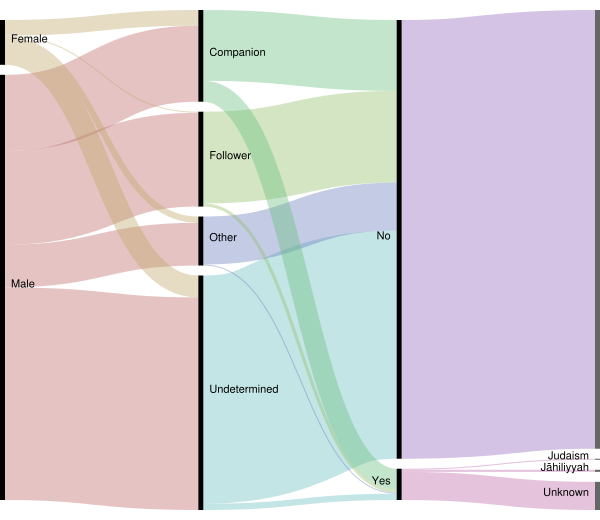
Our sample diagram uses the first option in Raw Density, which is what the creators behind Raw Density call an “Alluvial diagram (Fineo-like)”. (Fineo was a former research project by Density Design, the developers of Raw Density.) We’re using this type of diagram to show relationships among different types of categories.

Transmitters of early Islamic law

This diagram is based on 452 transmitters of early Islamic law. A transmitter is classified either as a companion or a follower. A companion is one who encountered Muhammad in his lifetime. A follower is one who lived in the generation after Muhammad’s death.

alluvialtransmittersStatusConverted

The data collected consists of 17 fields but for the purpose of this diagram we used only 4 categories: gender, transmitterStatus, Converted (Yes/No), priorRelgion. When the transmitterStatus was unknown then the transmitter was grouped into either other or undetermined.

In the diagram you can see how the colored ribbons visualize the data flow from the general category of gender to the more specific categories. The right-side of the diagram divides the transmitters into those that had converted from a prior religion (marked as ‘Yes’) and those that did not (marked as ‘No’).

Visualization allows for a clearer understanding of the data than is possible through a simple examination of tabular content in a spreadsheet. Visualization makes it easy to spot data collecting errors. For example, is there a distinction in the transmitterStatus field between Other and Undetermined or could we have collapsed that into a single field in our data collection form? Also, the visualization identifies where further research is needed, e.g., other data sources should provide details about whether the transmitters with undetermined/other status were companions or followers.

The students in this course will produce various visualizations using Raw Density.

Categories
DH Incentive Grants Pedagogy Project Update Tools

Raw Density & early Islamic law

Professor Joel Blecher received a DH Incentive grant from W&L for the course History of Islamic Civilization I: Origins to 1500. A pedagogical DH component of that course is for students to produce a set of visualizations of data that they have collected about the transmission of early Islamic law. The students will be using two tools for the visualizations: Palladio and Raw Density.

In this post we’ll examine the use of Raw Density. Separate posts will explore the use of Palladio and the data collection process. This post will provide one example of a data visualization of early Islamic law.

 Raw Density

Raw Density is a Web app offering a simple way to generate visualizations from tabular data, e.g., spreadsheets or delimiter-separated values. Getting started with Raw is deceptively simple: just upload your data.

The complicated part is deciding which of the sixteen visuals is best for your data. While an entire course could be taught on data visualizations, the purpose within this course is for the students to develop familiarity with visualizing historical data. Not all types of charts are appropriate for every type of data.

Our sample diagram uses the first option in Raw Density, which is what the creators behind Raw Density call an “Alluvial diagram (Fineo-like)”. (Fineo was a former research project by Density Design, the developers of Raw Density.) We’re using this type of diagram to show relationships among different types of categories.

Transmitters of early Islamic law

This diagram is based on 452 transmitters of early Islamic law. A transmitter is classified either as a companion or a follower. A companion is one who encountered Muhammad in his lifetime. A follower is one who lived in the generation after Muhammad’s death.

alluvialtransmittersStatusConverted

The data collected consists of 17 fields but for the purpose of this diagram we used only 4 categories: gender, transmitterStatus, Converted (Yes/No), priorRelgion. When the transmitterStatus was unknown then the transmitter was grouped into either other or undetermined.

In the diagram you can see how the colored ribbons visualize the data flow from the general category of gender to the more specific categories. The right-side of the diagram divides the transmitters into those that had converted from a prior religion (marked as ‘Yes’) and those that did not (marked as ‘No’).

Visualization allows for a clearer understanding of the data than is possible through a simple examination of tabular content in a spreadsheet. Visualization makes it easy to spot data collecting errors. For example, is there a distinction in the transmitterStatus field between Other and Undetermined or could we have collapsed that into a single field in our data collection form? Also, the visualization identifies where further research is needed, e.g., other data sources should provide details about whether the transmitters with undetermined/other status were companions or followers.

The students in this course will produce various visualizations using Raw Density.