Categories
DH Pedagogy

TimelineJS & the British Reformations

Students in a British history course recently completed an extensive timeline of the British Reformations in context. Professor Michelle Brock structured the project as an assignment that amounted to 15% of the course grade. The timeline also serves as a resource for students writing their final essays for the course. This approach to DH emphasizes that digital projects are not simply end products but also can inform written works.

Screenshot of British Reformations in Context timeline

TimelineJS was chosen by Brock as the appropriate tool for this project due to its visual capabilities. Prior to the beginning of the term, Brock consulted with the DHAT to plan how to instruct students on using this tool to contextualize the British Reformations. An essential feature was the tag functionality of TimelineJS to indicate whether an event occured in the English Reformation, Scottish Reformation, or the Continental European Reformation. Brock describes the goal of the assignment:

“The goal of this three-tiered timeline is to give student a visual overview of the trajectory of the European, English, and Scottish Reformations, and a more tangible representation of the relationship between the three. This should also provide a deeper understanding of the English and Scottish Reformations in their European contexts, as well as an illustration of their respective local and national dimensions. Students will then use this timeline to help write their final essay.”

Students worked in three groups of four to populate the spreadsheet that powers the timeline. Students were responsible for identifying and entering key events, documents, and people for their respective Reformation (a period spanning between 1450 – 1650). Each entry had to include a brief descriptive paragraph (80 – 120 words) explaining the significance of the topic. Students were encouraged to include images where appropriate. And, if applicable, students could include links to video on YouTube.

Each member of the group was expected to contribute 7 – 10 entries. Groups were expected to work collaboratively over the course of the semester. A librarian provided initial training to the class on January 19. The students completed their work on March 30. In addition, all the students had to turn in an individual timeline report that specified which entries they wrote and the list of sources used to write those entries.

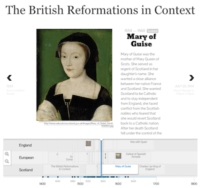
The final timeline has 73 entries about the Reformations.

Interested in using TimelineJS in your couse? See our introduction to TimelineJS.

Categories
DH Incentive Grants Pedagogy Research Projects Tools

Raw Density & early Islamic law

Professor Joel Blecher received a DH Incentive grant from W&L for the course History of Islamic Civilization I: Origins to 1500. A pedagogical DH component of that course is for students to produce a set of visualizations of data that they have collected about the transmission of early Islamic law. The students will be using two tools for the visualizations: Palladio and Raw Density.

In this post we’ll examine the use of Raw Density. Separate posts will explore the use of Palladio and the data collection process. This post will provide one example of a data visualization of early Islamic law.

 Raw Density

Raw Density is a Web app offering a simple way to generate visualizations from tabular data, e.g., spreadsheets or delimiter-separated values. Getting started with Raw is deceptively simple: just upload your data.

The complicated part is deciding which of the sixteen visuals is best for your data. While an entire course could be taught on data visualizations, the purpose within this course is for the students to develop familiarity with visualizing historical data. Not all types of charts are appropriate for every type of data.

Our sample diagram uses the first option in Raw Density, which is what the creators behind Raw Density call an “Alluvial diagram (Fineo-like)”. (Fineo was a former research project by Density Design, the developers of Raw Density.) We’re using this type of diagram to show relationships among different types of categories.

Transmitters of early Islamic law

This diagram is based on 452 transmitters of early Islamic law. A transmitter is classified either as a companion or a follower. A companion is one who encountered Muhammad in his lifetime. A follower is one who lived in the generation after Muhammad’s death.

alluvialtransmittersStatusConverted

The data collected consists of 17 fields but for the purpose of this diagram we used only 4 categories: gender, transmitterStatus, Converted (Yes/No), priorRelgion. When the transmitterStatus was unknown then the transmitter was grouped into either other or undetermined.

In the diagram you can see how the colored ribbons visualize the data flow from the general category of gender to the more specific categories. The right-side of the diagram divides the transmitters into those that had converted from a prior religion (marked as ‘Yes’) and those that did not (marked as ‘No’).

Visualization allows for a clearer understanding of the data than is possible through a simple examination of tabular content in a spreadsheet. Visualization makes it easy to spot data collecting errors. For example, is there a distinction in the transmitterStatus field between Other and Undetermined or could we have collapsed that into a single field in our data collection form? Also, the visualization identifies where further research is needed, e.g., other data sources should provide details about whether the transmitters with undetermined/other status were companions or followers.

The students in this course will produce various visualizations using Raw Density.

Categories
DH Incentive Grants Pedagogy Project Update Tools

Raw Density & early Islamic law

Professor Joel Blecher received a DH Incentive grant from W&L for the course History of Islamic Civilization I: Origins to 1500. A pedagogical DH component of that course is for students to produce a set of visualizations of data that they have collected about the transmission of early Islamic law. The students will be using two tools for the visualizations: Palladio and Raw Density.

In this post we’ll examine the use of Raw Density. Separate posts will explore the use of Palladio and the data collection process. This post will provide one example of a data visualization of early Islamic law.

 Raw Density

Raw Density is a Web app offering a simple way to generate visualizations from tabular data, e.g., spreadsheets or delimiter-separated values. Getting started with Raw is deceptively simple: just upload your data.

The complicated part is deciding which of the sixteen visuals is best for your data. While an entire course could be taught on data visualizations, the purpose within this course is for the students to develop familiarity with visualizing historical data. Not all types of charts are appropriate for every type of data.

Our sample diagram uses the first option in Raw Density, which is what the creators behind Raw Density call an “Alluvial diagram (Fineo-like)”. (Fineo was a former research project by Density Design, the developers of Raw Density.) We’re using this type of diagram to show relationships among different types of categories.

Transmitters of early Islamic law

This diagram is based on 452 transmitters of early Islamic law. A transmitter is classified either as a companion or a follower. A companion is one who encountered Muhammad in his lifetime. A follower is one who lived in the generation after Muhammad’s death.

alluvialtransmittersStatusConverted

The data collected consists of 17 fields but for the purpose of this diagram we used only 4 categories: gender, transmitterStatus, Converted (Yes/No), priorRelgion. When the transmitterStatus was unknown then the transmitter was grouped into either other or undetermined.

In the diagram you can see how the colored ribbons visualize the data flow from the general category of gender to the more specific categories. The right-side of the diagram divides the transmitters into those that had converted from a prior religion (marked as ‘Yes’) and those that did not (marked as ‘No’).

Visualization allows for a clearer understanding of the data than is possible through a simple examination of tabular content in a spreadsheet. Visualization makes it easy to spot data collecting errors. For example, is there a distinction in the transmitterStatus field between Other and Undetermined or could we have collapsed that into a single field in our data collection form? Also, the visualization identifies where further research is needed, e.g., other data sources should provide details about whether the transmitters with undetermined/other status were companions or followers.

The students in this course will produce various visualizations using Raw Density.

Categories
DH

W&L to Host International Science Conference

Washington & Lee University will host an International Meeting entitled Newton’s Apple and Other Historical Myths about Science on May 9-10, 2014.  This conference has been organized by Kostas Kampourakis (University of Geneva), Ronald L. Numbers (University of Wisconsin-Madison), and Nicolaas Rupke (Washington & Lee University).

Conference Program:  Historical_ Myths_Conference_Landscape-format

Categories
DH

American Historical Association blog entries about digital pedagogy

Check out this discussion about digital pedagogy: http://historyinthecity.blogspot.com/2014/01/doing-digital-history-with-undergrads.html

Categories
DH

Digital Humanities at the Winter Academy 2013

Through the Dean’s call for cohorts, we are able to offer a fantastic digital humanities program on Wednesday, December 11 during Winter Faculty Academy.  It will be held in the IQ Center, Science Addition 202A.

Digital Humanities 101:  DH in the Classroom

  • 9:00-9:30 Breakfast and Informal Discussions
  • 9:30- 9:45 The Importance of DH at W&L (Paul Youngman)
  • 9:45-10:45 Morning Keynote: “Digital Pedagogy in the Humanities: Models, Keywords, and Prototypes,” Rebecca Frost Davis
  • 10:45-11:00 Break
  • 11:00 – 11:45 Digital Humanities Tools of the Trade #1: WordPress (Bucy)
  • 12:30-1:45 Lunch Speaker:  “Blake, Biofuel, and Bribery: Interdisciplinary Applications of Computing,” Valerie Barr, Union College, NSF
  • 2:15 – 3:15 Digital Humanities Tools of the Trade #2: Voyant (Mickel), MApplication (Keen, Benefiel)

You can sign up for this event at https://managementtools2.wlu.edu/EventManager/pages/Page1.aspx?EventID=57

Categories
DH

Run With the Pack

Check out William Pannapacker’s latest Chronicle article about “hacking” and “yacking”, and how DH scholars will, increasingly, be ‘working in packs’ to chase down bigger topics:

http://ezproxy.wlu.edu/login?url=http://chronicle.com/article/HackingYacking-About/141311/?cid=at&utm_source=at&utm_medium=en

Categories
DH Event on campus

Announcing 2013 Fall Academy Session on The Pedagogy of Digital Humanities

Session Title: The Pedagogy of Digital Humanities

Session Description: Interested in integrating the tools and techniques of Digital Humanities into your courses?  Curious about what Digital Humanities projects entail? Bethany Nowviskie, Director of Digital Research and Scholarship at University of Virginia’s library, will share her expertise with us at this lunchtime session. Bring your appetite and your questions.  Event sponsored by the Associated Colleges of the South. See http://nowviskie.org/2013/resistance-in-the-materials/#more-1978 for more information on Bethany.

Categories
DH

American Academy of Arts and Science Commission on the Humanities and Social Sciences

This report is a good start at a national conversation on the importance of non-STEM fields.  Check it out here.  Leave your thoughts below.

Categories
DH

Alan Liu in the most recent PMLA

Very thoughtful essay by Alan Liu on DH methodologies in the most recent issue of PMLA.  Check the Sakai site if you are not an MLA member.